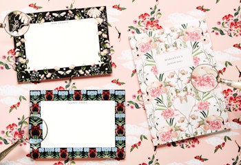
Spearheaded by creative director Amy Powney, fashion brand Mother of Pearl is renowned for its humorous and elegant prints that, on closer inspection, are hiding surreal secrets. Whether it's eyeballs in flowers or lobsters holding combs, there's no wonder that the brand's motto is “serious fashion, not to be worn too seriously.”

Since Amy took creative control in 2015 (after joining the brand back in 2006) Mother of Pearl has become a major player in the British fashion industry – this year saw them win the coveted Vogue Fashion Fund. So we were excited and delighted to collaborate with them on a new Papier collection that pairs their fun and floral designs with notebooks, notecards and wedding stationery ready for you to personalise. As it launches, we spoke with Amy to dive into her design process.


The Mother of Pearl ethos is described as “serious fashion, not to be worn too seriously,” how does this manifest in the clothes you create?
I always try and use a sense of humour when designing. I look to socialist photographers like Martin Parr and the tracksuits I grew up in in the 90s; a funny combination like this referenced alongside a romantic or indulgent subject such as a Caravaggio still life. Luxurious fabrications and intricate cutwork balance out the grittier foundations of my northern upbringing; thus achieving contemporary product stitched together with some tongue-in-cheek finishes. The product ends up in luxury stores with the hope that the wearer appreciates fashion and quality but once on her back, doesn't take herself too seriously in it!


Where does your sense of humour come from?
I think my upbringing ‘up north’ cemented this. No one took themselves too seriously and if you did you were soon put into your place with some cutting sarcasm! I don't think you can ever escape that, it's ingrained forever! I use this irony in my work – in what can appear a very serious industry.
Some of the details in your prints are quite surreal. What's the thought process behind them? How do you decide on a lobster holding a comb for example?
We like to have fun with fashion. We find a beautiful reference for the body of our prints and then add a little Mother of Pearl twist. A lobster combing his tentacles is a totally normal topic of conversation in our studio.


How did you decide on the prints that you used in the Mother of Pearl & Papier collection?
We worked through our archive to pull all the ones that would translate the best, and we also have new prints that will be launching with the show in September fashion week.

What’s your favourite item in the collection?
I love the personalised notebooks with the diving print, they are such good quality and such great gifts. The Papier collab seemed such a perfect base for our prints – the product looks so brilliant!

What is it you like about using notecards and notebooks in the digital age?
I have never totally got to grips or indulged in technology. I use technology for needs-must but I still love the tactility of pen and paper; from designing/sketching to the unbeatable feeling of scribbling a handwritten note – without indulging in excess paper of course! I seem to get my thoughts down better when it travels via pencil to paper.


The Mother of Pearl prints always have a joyous secret or two that’s revealed on closer inspection. Is there anything else you’ve come across which has caused you to raise a smile after giving it another glance?
Childhood photos. My parents have a box load at home, all printed and stuck in albums with the film in the front pockets and squashed in a giant box. They never get old, every time you go back you see something new to laugh at – huge hair and dodgy outfits seem to get better with time!
Discover the complete Mother of Pearl x Papier collection here or browse through a selection below.


